Friday, 24 May 2019

Graphic Design - III Major Project / Zebra Dental practice / Reflection / THE END

Hey everyone


It's time to think how successful was this project. In the beginning, I wanted to mark the most difficult elements of this project for me to research the market and to think about the various aspects for which this project was important. Market research and adapting it to the needs of advertising my dental practice. During the project, I met a lot of interesting information about dental clinics.  Such information as what is important for the patient and what comfort/amenities the clinic must have in order to make the target group happy and return to the clinic. I have learned how to create interior design for my project. That was a great opportunity to get know some new tools or filters in Photoshop.  The example of a new tool which I used was a vanishing point. Furthermore, I understood how to create the directly right type of advert. So I met and learned a little bit from the marketing department which will cause me to be better prepared in the future to select advertising for a correct business. At all I am happy with all elements of my project, especially the logo. In this case I could think about other solutions of present teeth in logo. Maybe I could think about a zebra pattern behind the teeth, and leave a teeth white. In a future I'll think carefully about different solutions to this issue. Thanks to my tutors for amazing support which has been given for me during project.

All my projects are available to see on my website ----> WEBSITE

below also my Facebook page

Facebook PAGE


Sunday, 19 May 2019

Graphic Design - III Major Project / Additional elements of branding

Hey

I designed additional elements of branding which I did not include before, treat it as a curiosity. I took opportunity to design those elements to show for my costumers, other fields of adverts of my portfolio.


1. Personalised outside banners

2. Bus signs 


3. Car signs 


4. Gadgets  - lanyard 


5. Gadgets - Mugs


5. Stand out from others - Roll - up banner 


Graphic Design - III Major Project / Stationery kit creation

Hey
I have designed stationery kit for Zebra. Furthermore, I have decided to design additional elements: car sign, lanyard, mug, roll-up banner and bus sign.

I have started design stationery kit from businesses card with standard UK size - 85 mm x 50 mm

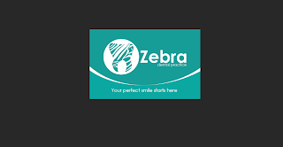
On a first side of card I have decided to insert a big logo in white version and background with colours from logo palette. Under the logo I put a tagline 'your perfect smile starts here'.

Again I created waves in this case is white. I repeated activity like on billboards to design this wave. This is my personal method, some other designers doing this differently.


In my opinion looks very nice, especially the front of card presenting only the logo and tagline is very good. Now, I started to design a back site.
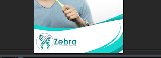
In this case I decided to insert picture of brand ambassador in circle on left hand card. I added additional circles with blending options I added stroke with main colour.


In result I got nice design which comes from my head.


Now I wanted to add important information: name and surname, tittle, phone numbers, Facebook page and email. Furthermore, on background I added big circle because this side of card was a bit empty for me, too much white colour. 
Final outcome: 


I am quite happy with this design, but in the future I could think about little space which will be writable to put information by reception person about next an appointment or design special little card or little notebook with torn pages to notice by reception person information about next an appointment. 


Now I am going to design a folder for documents. In standard size A4. 
In this case I decided to insert a logo - big logo original one / main logo design on a front page. I added my brand ambassador and under the logo I put web address. 


Also I included a tagline. On bottom part of folder I added location of surgery. 
I have designed also a letterhead and envelope in A5 size. All those things I compare into one file and located them next to each other. 


This is my final outcome of designing stationery kit. 


I am happy with this design, but I could think about design more helpful gadgets. I think that in this case (dental surgery), I could develop project to design wall or fridge calendars - in this kind of businesses this type of adverts are very good. Who of us do not have a calendar at home ?  Advert on it is perfect because sooner or later we will need a specialist in the dental field so this advertisement is at your fingertips, always you can have contact to your favourites dentists just look at calendar.  

I think that balloons with own design are also perfect marketing materials especially for events like open days. You can promote your businesses easily.   


Graphic Design - III Major Project / Web adverts creation

Hey

I have finished my web adverts. I have decided to use the most common sizes that occur on the internet :
- large rectangle (336 x 280 PX)
- wide skyscraper (160 x 600 PX)
- leader board (728 x 90 PX)

To design this kind of advert I created new document with sizes above.
Process of designing is pretty much the same as on billboards. In these ads I have used other models which I did not use before. This page was my inspiration to choose sizes of web ads - web-design banners

Additional elements which I created in this case are: pattern from sharps which are in Photoshop, you need just to chose all sharps in view.


result: 


I created button 'click here'  to do that I used rounded rectangle tool.


I included same information as before. 


Final outcome:


Graphic Design - III Major Project / Poster creation / Bus stops

hey
This post shows process of poster creation. I have opened new file in PS B1 size as a big poster.


I added my model into poster as a brand ambassador He will be on all rest of projects. 
Again I added ellipse and I modified this one to get sharp which I would like. 
I have used this tool: 

I did same activity to get in result this what I like, this what will be the best in my opinion. I got now nice wave. 

I added the logo on bottom part of poster. I do not like this I have to much empty space in bottom right corner.  I decided to create another nice waves using pen tool, I have drown new sharp of wave. 
result I got

I did similar waves on top part of poster using same tool. On the top I have put website address.
The new things which I added to poser are sharps of teeth. The sharp of teeth I took from logo, I only modified a little bit a sharp of teeth using pen tool, I inserted copyright images into teeth using clipping mask in blending options.


I added these tooth in the middle part o poster where u can see empty white space. 

This is final outcome of poster: 


Saturday, 18 May 2019

Graphic Design - III Major Project / Billboard creation

This post shows that how I designed billboard in Photoshop. Billboard campaign include seven billboards with different information on them. Information on billboards are properly matched to the specification of service performed by Zebra dental clinic.

New document in PS with standards billboard's size.

I have added my 1st model into my 1st billboard, in this case I decided to pasted him on left hand side. In next step I created a few ellipses and transformed them into my sharp, which I liked as on screen below. To modified  them like on screen below I used tool 'switch between free transform and warp models' and coped 2 times. I changed colour on those in background. In foreground I left white/ In result I got nice wave. 


Now I got nice effect, but I have to hide them and move my model on foreground. I used quick mask tool to paint arm of my model, in result I get market arm. I coped a layer via copy. In result I got now layer with arm of my model, now I have to change the order of layers to hide ellipses.


I added a logo on right hand side in corner. Also I started adding important elements/information which from my experience a have to include on billboard design such as: website address and address of location dental practice. To create backgrounds of these elements I used polygonal lasso tool. I added shadows, overlay colour. 


I added website and address  on it, also I added free icons to illustrate location and opening hrs. I got those icons from flaticon - best free tools for graphic designers  This 'sign' I located next to model's head. 

At this moment billboard looks quite good, I like it! 

Let's add a main tag line and I decided to add information about booking an appointments. Phone number and little icon, this icon informs audiences that They can book an appointments 24/7 just call the number. To do nice shadow effect in text I used blending options. I am not gonna that much details abut that. I wrote a lot about how it is easy in previous term. Final effect below: 


Now as you could see that i have a lot free space on left hand site over the website address. From my experience about dentist in UK I known that many clinic will change you just for check your tooth or just consultation. I decided to add a little sign, sharp of this I have from Photoshop, on sign I added overlay gradient, I did same activity like in overlay colour on logo. I typed no fees consultation. below final out come: 

I am happy with billboard design, of course I have designed 7 of them. I'll write about the process of designing rest of them because the process is the same as on this which you are able to see above.  
I think that billboard include the most important information and I do not need to adding any more, but this is my opinion. 

I have used again amazing free tools for graphic designers - mock-ups. 

I developed my presenting of ads elements using mock-ups. 

Below all my billboards. 

Billboard campaign: 

1. Don't hide your smile 

2. Family dentistry 


3. Love your smile


4. Get a straight and beautiful smile for life  


5. Take care about your smile 

6. Terrible toothache 


7. Your perfect smile starts here 


Raw project without mock ups are available to see HERE

I have developed my project to different target market - old people are very welcome in Zebra dental practice.