Saturday, 9 March 2019

Graphic Design - II Major Project / Business card design

Hey!
In this post I will state process of designing a business card for a sales advisor in company.

Firstly, I have chosen basic size format for my card, it is 95 mm x 55 mm. This is basic format, it is very handy because it fits in the wallet and has a similar dimension to the bank card.

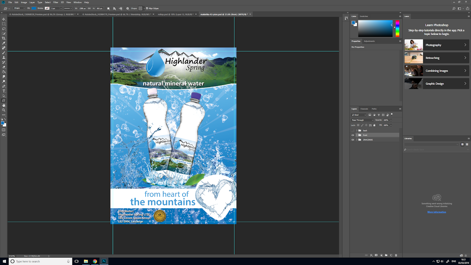
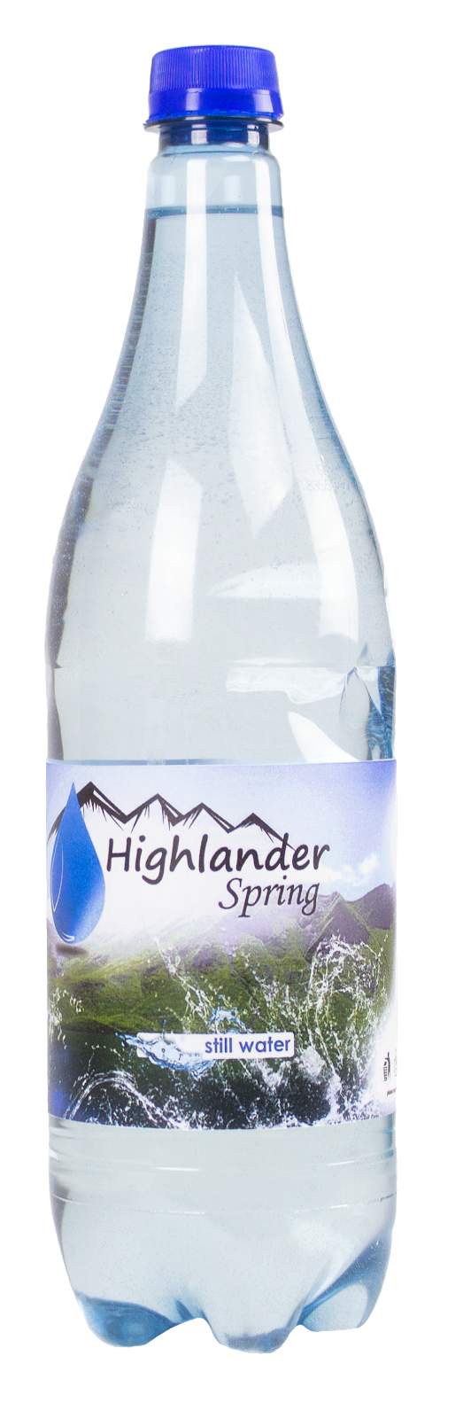
On a front side I pasted my mountains picture which I get from free pics bank. On that side I included also logo in very big format to shows company. It is very necessary to recognise it by potential costumers. Behind the logo I added a white shadow to move the logo to the foreground. As a result a I got this:


You can recognise this view from previously projects, it is a part of campaign with similar design.

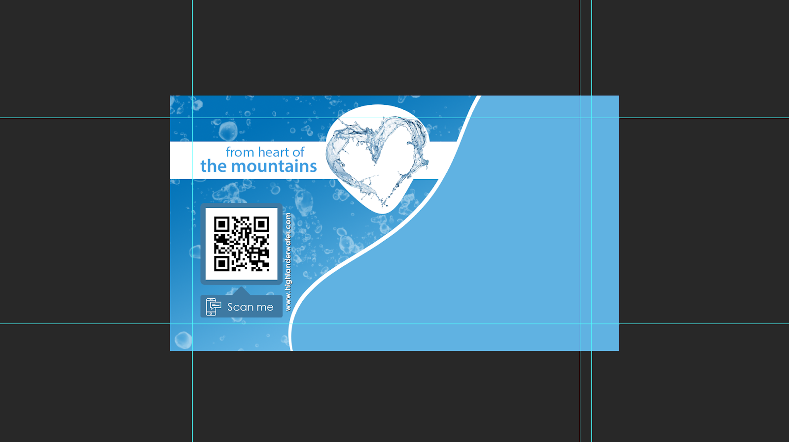
On the back side I pasted blue background on whole project. I used a gradient tool.
Now I decided to separate card on two parts left and right. To do that I created a wavy line on the middle. I used line tool to do str8 line and I modified it by function called 'switch between free transform and warp modes' like below:


On left part of my card I added bubbles by Photoshop brush and I decided to add a tagline from poster and roll up - 'from heart of the mountains' with water heart graphic. Furthermore, I found a free QR code generator and I used this free copyright machine to do for me special QR code  which after scan move you to fictional website. Also I included website address next to Qr code. The left side of card is finished as below.

Now lets move into next part - right. In this section I will put important information about person who is holder this business card. Name and surname, address, phone number, e-mail and tittle, those are the most significant information also they are a fictional. I added free copyright icons.

As a result I got completed business card:


To presented my final outcome I used free copyright mock-up.


Graphic Design - II Major Project / Poster Design

Hello guys !

Tonight I am going to show you how I have changed my billboards into posters.
This was a basic action, I transfer project from huge format to small B1 poster.

I will not explain how i transfer those size to target size because It was very simple action.


As a outcome I get those posters: 


Unfortunately, I couldn't change my 3th billboard because the characters which are on graphics, they are too big and I am not to able to transfer whole graphics. The poster looks weird. These three poster look nice and they are good enough. The first one is a part of same recognising campaign where all project have similar design. Rest of them are a campaign with some hide information in background. 

Sunday, 3 March 2019

Graphic Design - II Major Project / Developing project by own mock-ups

Hey! 
To show my final outcomes and presenting them I went around city - Leicester and I took many pictures which I can use as a my own mock-up. 

Below row pictures and after my interference. 


Before:


After:


As you see above I did my own mock-ups, but not every single element of campaign. Only those which I was to able to do. 

Graphic Design - II Major Project / Bottle label design

czesc!

Today I will show you how I did a label design in PS.

I have chosen random size reminiscent of label on the bottle. In this case it is 27 cm x 9 cm. Into document I added my mountain photo from free copyright photos bank called PIXA BAY.

https://pixabay.com/photos/schrecksee-bergsee-allg%C3%A4u-2534484/
I added it as a background, it shows that source of water is from mountains. As we know every single water label including:
- information about mineral contains
- logo
- info about what that water is sparkling or still
- measure of bottle
- necessary information

I have done already table of contains as below:

After I will add it into project. 
In project, I added information logo ect. The most common info I had to highlight by added white blur background like here under the contains table: 
I did the same even with the logo. 

My final outcome: sparkling water


and still water

Graphic Design - II Major Project / Design the A5 leaflet

Yo!
In this post I will describe how I went thought the design leaflet A5. I decided to design A5 size because, I just wonder that is the most common chosen of leaflet sizes available on the print market.

My A5 leaflet has a same first side as on roll-up banner, this kind of adverts have same elements on every single element.

On the other side I decided to put information like: the prices of bottled water which is recommended retail price by company; it does not have to be this price in shop it is just recommended price of every single product, the short introduction of water, in the bottom part I have put information about where the water is available to buy, I used logos of big and small shops in the UK.

I used basic tools in Photoshop, exactly same as in previous posts. Polygonal Lasso tool has been used to design fancy shapes behind the bottles. I duplicated them and changed a little bit position and colour for a bard blue. I added a fancy inscription - 'now available in'. I used green colour, but it is not exactly green, is also a bit yellow. To do that I used blending options, I changed there:
- Bevel & Emboss
- Stoke
- Inner Shadow
- Inner Glow
- Satin
- Colour Overlay
- Gradient Overlay
- Outer Glow
- Drop Shadow

This is eye catcher effect, outcome looks like below:


Below is final outcome with free mock-up from same website as Roll-up mock-up.


Graphic Design - II Major Project / Creation of indoor advert - Roll-up banner

Hey, in this post I will display you process of design roll-up.

First, I will tell you what is a roll up banner. Roll Up Banner Stands, also known as Roller Banners or Pull Up Banners, are an important resource for any exhibitor looking to stand out at an exhibition or trade show. They can also be used to make a big impact in your shop or place of business as a great addition to your point of sale material. It is good type of advert which you can display at shops, cinemas, bus stations etc.

I decided to create a roll-up banner with dimensions: 85 cm x 200 cm. In new document with those dimensions. I added blue background into project. I used two different blue colours - #66bef5 - on the top part of roll up and #0272b8 on the bottom. I used gradient tool to do this. I added a bubbles by brush available in PS. Also I added a special shape on the middle of my project. I used custom shape tool to do that as below:


In next step I keep focus on the top of roll up. In this part of banner I would like to see a logo of company. I added logo and I used same copyright FREE image like on the label from pixabay.
Behind the logo I added a white shadow to exhibit logo from a background. I added a one of important information below the logo ' natural mineral water' and added white stoke of shape on the top.
After that, on the middle I added my bottles of water with label. Unfortunately, I could not use my own pics of bottle because, they ware not good enough to this project. I took a few pictures of them in the studio.


Cutting off background was too hard to do and bottle does not look realistic. Combinations of shadows and lights does not let me to remove background to perfect, that's why  I did not use those pics. 
In next part of designing roll up I added my FREE copyright bottle mock-up on the middle roll up. Also I used copyright free slash water as below: 
All of them are from FREE PNG VECTORS AND PICTURES
https://pngtree.com/free-png-vectors

https://pngtree.com/free-png-vectors

https://pngtree.com/free-png-vectors

https://pngtree.com/free-png-vectors

https://pngtree.com/free-png-vectors

https://pngtree.com/free-png-vectors

https://pngtree.com/free-png-vectors

https://pngtree.com/free-png-vectors

My bottle of water is available to download with copyright free here: Bottle of water  


Next step which I have done was added a main tagline under the bottles with copyright free image of slash heart water. I was used white background under the tagline and heart - I had to create individual sharp under the heart because heart was protrude over the simple shape. At the end of designing the roll up I added address of distribution centre and icon of certificated water from label. Furthermore, I had to remove a water bubbles, because was too much them around the bottles. To insert water water babbles I used photoshop brush.

Final outcome: 


Furthermore, to display it on my website I used free roll-up mock-up available from HERE.

Outcome below is presenting very well I think so. I am quite happy with that.