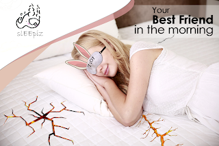
Yeah! We got it! That's final version of our project - advertisement of eye sleep mask.
Now I will explain how we decided put tagline and why we used this font. In term of the word, the tagline is a formal font while the logo font is informal font. This is because we want to welcome everyone to purchase or try our product.
I decided to make the disappearing background behind the slogan to move the slogan to the foreground. I used very simple function to do that - layer mask and using gradient tool I created this cool effect witch you can see below.
After discussion with my group (Pedro and Kani) We decided to connecting logo into project.
We choose upper right corner as a place for a logo. When I put logo to project, it did not look good, because Logo has similar colors to bed on this picture. Therefore I created background behind the logo. I used one tool in Photoshop.
I just make an ellipse through "ad shape". I duplicate function and turned a shape to looks like a waves. I changed a color - to do that I used tool - color picker in PS.
At the END I Added logo to final project. This is final outcome of our advertisement.
Self reflection:
I think that project should have more information about product such as 'how to use', contact to company and .social media. Furthermore ad should looks more realistic. However now I know which skills I need to improve - what I have to do in future to creating better visual.


A much better post - really shows the design journey and you have some reflection as well. As we discussed today, just need to add the research!
ReplyDelete