Tuesday, 23 October 2018

My wix - simple - website part I

yo!

Today I created my new website by wix.com. It is easiest web creator - online!


To my personal website I choose a simple template called - 'Graphic Design Portfolio'. You can find some screenshots below.


It is very simple and clear template. I have chosen this one because is perfect to presentation my works and project. Also I like simplicity and transparency things. 


I have done some research to look at websites other artists. 


mariakrauze.com

This page is very readable and design is simple. 

www.martazalewska.pl
interpolska.net

In next step on ma website I decided to remove original menu bar, because it was under the gallery. 
I created new one, next to my personal logo, which I created and used before came to UK.  I put horizontal menu bar with edited. I changed color of font and names of pages. 


After that, I put into my website my personal logo. And tadammm ! 
This is effect: 

Furthermore, I added a huge slideshow to exhibit my main specializations.


Below the slideshow a left original gallery and footer. 
In other pages I have done many changes so I will explain it in next post. 


Monday, 22 October 2018

Product Design - Major Project / mind map

Hi!

I have successfully done my research lunch box project. It is the time which I have to come up with idea by myself as a product design student. I decided to create self - heater lunch box.

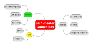
 I created a mind map which links all my idea together. I used MIND MUP

We have filled 'Sign Off Sheet'. Click HERE to see.


Product Design - Major project / research / idea

Hey everyone!

Today I was thinking about my Major project and after few hrs, as a product design student, I came up with something new. The thing - to use every day, practical thing.

Self-- heater lunch box. 

If someone like a warm food, but cannot eat it straight after making it ? Taking it to work ? or maybe you are going to park ? My self-heater lunch box is an answer for all these questions.


I have done some research about the lunch box design by Chris Place and Will Matters.

www.feeldesain.com
www.feeldesain.com

www.feeldesain.com


I have done some research about them because they created a prototype lunchbox which is set to improve your lunch breaks as well as give you much-acclaimed cool-kid-brownie-points in the office thanks to its trendy look.

They also created an app with the help of chefs and nutritionists, that makes it easy to plan out your lunches, depending on your dietary requirements.


https://www.amazon.co.uk/dp/B06XSF7R9Q
I have't find any lunch box which is heater without a plug in to power socket.

From the research, I am inspired to design lunch box, self-heater witch you can use anywhere, where you are hungry for example in park where u cannot use microwave, in a bus. Also I want to develop 3 not trivial designs based on the product development, e.g. a rugged outdoor one, office based worked one and the standard one.


Saturday, 20 October 2018

Today Presentation Reflection

Hello!


Today I have presented to my class about our eye mask project (advertisement project). We were given 5 minutes for the presentation, However, we have used more time than that. My friends suggested that we should given more precise information and managed our time well. Also we have to improve communication between each other in group and I should be less nervous. Furthermore They suggested that we have to presentation step by step how we made this product and which tools we used to create this ad.  


To conclude, I have a lot of things to improve in my presentation but I think it was a good practice for us as presentation skills are needed useful for both work life and university. 


This is a final outcome one of groups. I like the most this project. They presented it very well. Poster looks professional and is easy to understand. The poster gives the modern sense conveying today's society problem.

Wednesday, 17 October 2018

Product Design Part V (Final outcome)


Yeah! We got it! That's final version of our project - advertisement of eye sleep mask.


Now I will explain how we decided put tagline and why we used this font. In term of the word, the tagline is a formal font while the logo font is informal font. This is because we want to welcome everyone to purchase or try our product.


I decided to make the disappearing background behind the slogan to move the slogan to the foreground. I used very simple function to do that - layer mask and using gradient tool I created this cool effect witch you can see below. 


After discussion with my group (Pedro and Kani) We decided to connecting logo into project. 
We choose upper right corner as a place for a logo. When I put logo to project, it did not look good, because Logo has similar colors to bed on this picture. Therefore I created background behind the logo. I used one tool in Photoshop.


 I just make an ellipse through "ad shape". I duplicate function and turned a shape to looks like a waves. I changed a color - to do that I used tool - color picker in PS. 


At the END I Added logo to final project. This is final outcome of our advertisement.


Self reflection:

I think that project should have more information about product such as 'how to use', contact to company and .social media. Furthermore ad should looks more realistic. However now I know which skills I need to improve - what I have to do in future to creating better visual. 


Monday, 15 October 2018

Product Design Part IV (become a final version)

Hello guys!

Pedro created our logo. Below you can find some screenshots of this progress.


How we see Pedro drew some things kind of clouds. I think we wanted to connecting all thing related with sleeping. It looks very good. The cloud in our logo even has an eye mask which presentation main thing whats company selling.


From the screenshots I can deduce that Pedro used a few tools in Photoshop to cut off background from logo and also He used function magic wand to mark a black scratches. This function it's very helpful when We want to mark some thing, but it has to be solid color.


I think that logo created by Pedro is very good because is showing exactly this what We wanted to give our customer.

In next post I will put logo into our ads. 


Wednesday, 10 October 2018

Product Design Part III

Good evening Everyone! 

Today was hard and long day. During the class, I had a great opportunity to further develop my project with Pedro and Vethanee. We decided to put on our ads project some crack such as earthquake, on a bed to in order that to show that our sleeping mask has a vibrations. Below you can find screenshots how I added them to our ads.


freeplik.com

We added lava texture to make crack more realistic.

freeplik.com
Furthermore we added another one crack with other texture.

freeplik.com


In the next step We append our tagline on a top side an ads.


I decided to make a white background behind a tagline to emphasize font. The left side of white rectangle is fade away what create readability and cool effect.


After discussing with Zoe, She suggested that cracks witch We made on project are a little bit scary. Furthermore, She implied to show vibrations other way such as by added a wavy lines over the ears.


To make it I used this icon below.


flaticon.com

We still discuss our project with colleges what we supposed to change.

See you in the next post!


Tuesday, 9 October 2018

Product Design Part II

Hello Everyone!

Today, during the class, I developed our further project with Vethanee. We all have concluded that the advertisement should be in digital form.

To prepare initial digital project, we have chosen  photo below because this is perfect image to show our sleep mask. Women is sleeping, which emphasize purpose of this product. Furthermore she is smiling, representing her happiness towards our product.

pixabay.com


Below you can find our initial digital project in PhotoShop.

I created eye mask in PS, I used the function "add shape" to added a black shape and mould it to look like eye cover.


We decided added funny bunny ears for the design and to hide black base. The new texture impart nice - looking style. I found this bunny ears from free renders bank as a PNG file. 


Pedro also shared some the design for the eye mask and we all agree that they have excellent designs which are suitable for our targeted customers. 


See you in the next post :)


Product Design part I

Hey!
Yesterday I started a new project with my classmates Vethanee and Pedro.
We have come up with the product which would enhance students to wake up to school or university - A funny magic alarm eye cover.


This is an ordinary eye patch which commonly use in everyday life.

www.quora.com


Photographic sequence - research and my project

Hey!
Today I have come up with the idea of producing sequential image project. 

What is a sequential photography? 
It is the art of showing the viewer a single moving object on a single image in different stages of movement. In order to create such an image, you need to take a photo of a moving object at multiple frames per second, next you will need to use some kind of photo editing software to piece the image back together as a single image. ~ ba-bamail.com


ba-bamail.com, Steve Granger
On this photo we see that someone used some kind of photo editing software to piece the image back together as a single image. This technique is especially fun to use with certain sports such as any type of biking, running and jumping!

Commentary on the research: 

Steve Granger 

I like his artwork a lot as it shows the cycle of the story and the story is very interesting as you have to carefully study bout the image to fully understand the meaning. It is not only unique but also meaningful. It is because the story is short but have a huge impact on readers.

''Things Are Queer'' - Duane Michals
In the first image we have what appears to be a bathroom suite. In the second image the camera perspective moves slightly closer to the wall and fittings, and a  foot and lower leg that are so large as to be out of proportion with the fittings is introduced into the scene. 


What are we to make of this sequence? It might be tempting to say the circularity of the image narrative is the point at leave it at that, but this is unsatisfactory for two reasons. First, it is hard to not suppose that the handwritten title at the top makes reference to Michal's  homosexuality, and as several critics have taken this to be the key to the interpretation of the whole.


It was my great opportunity to improve my photography skills. I went with my friend Kani to local park and there i decided to make a sequential pictures. I wanted to show some kind of parkour.

So that is the final result of my sequential images. It was really fun. Photo is auto mode and natural light, taken around park on sunday afternoon. Photos been taken by Kani Iphone 8+ and edited by application called pic collage.


This sequential image shows me having fun like a child. Indeed, being a child is fun and I really want to go back in time. I personally like the outcome and it was a lucky day that it was sunny. Hence, the natural light enhances the picture. If I have more time, I would photoshop my final piece with the fading effect. It would enhance the meaning of the picture and it may capture viewer attention.


Monday, 8 October 2018

Logo Design

Hey! In this post I will present my personal project. 

A few months at my work I get order to created logo of company called Corsoo. A customer wanted to created logo his company with orange color in some part of it. After discussion with my team of graphic designers in ads agency, I decided to put into logo 'C' as a first letter and two 'O' as a two last letters. I thought that was a good idea, because name of company allude to logo.

I started with scratch something on a paper, very simple circles. I decided that first wheel I changed for a "C" to show first letter of company name and created these two wheels to look good with first sign "C".

Ok looks good! What now ? I have to transfer it to digital version!
To do that I used photoshop and illustrator. I do not have a screenshot of this process but I will explain how i got to final version. 

In Photoshop I created one circle using the function "add shape". After that I used another one circle to cut equal circle inside first one. Now I had a good-looking 'O' so I copied it to three 'O' into my project. I decided to put middle 'O' on first plan. I removed a bit of last 'O' which was on left side, inside a middle 'O'. Next step which I had to do, was created a 'C' from first 'O'. To do that I used an elliptical selection in Photoshop to removed part of circle. Now I had a clear digital project without any texture and colors. I used function "colour palette" to find orange color which will be the best to put into logo. By trial and error method i decided that the best option will be to put orange color into 'C'.


After discussion with customer I decided to put tagline under the logo. The company sells kitchen equipment for restaurants, pubs, hotels ect. On my project it's "Gastronomia w każdym calu" which means in english "gastronomy in every inch". I'm an author of this tagline. 


Below final project.


Customer was very happy with this project. 

Upgrade: 15.10


Welcome to my blog

Hello everyone! I am Arek, a product design student.


I'm from Poland and my family town is Busko-Zdroj. I have one brother and I miss him soo much. The first day when I came to England I was really scared. Everything was so different, but now after 3 years, yeeeees I feel so save as in my home :) I came to De Montfort University in Leicester to finally do what I really like. I'm so pround of myself.


As I remember from my early childhood, I loved to draw on everything that was around me. At the beginning on the walls at home, what my parents did not like. Then I could draw on the appropriate paper, adapted for that purpose. I continued to doing this during my further education. I was interested in computer graphics. I studied this subject in high school. I understood that this is what I would like to do in the future. After high school, I worked in a graphic studio preparing various advertising projects. I'm familiar with Adobe and Corel software.


I study a Product Design becouse it will be a great chance for me to raise my qualifications to a level that will allow me to work in my favourite field. I would also like to improve my skills in using other computer graphics programs. Another reasons to study Product Design is a great opportunity allowing me to gain a professional qualification at an accelerated pace.

I'm inspired by computer graphic designer. He's name is Saul Bass.

en.wikipedia.org

Saul Bass was an American designer whose 40+ year career spanned everything from print and identity development to movie title credits. He worked with major corporations to establish logos and branding guidelines, including AT&T, United Way and Continental Airlines. He designed titles for over 30 films and he won an academy award for his short film Why Man Creates. Also proficient in typography his "cut-paper" style is one of the most recognized styles of design from the 1950s and 60s.

Below you can find his historical works:

1. Logos - Do you recognize any of them ? Some of them are still in use. 
en.wikipedia.org
The iconic movie poster design by Saul Bass for the 1958 Hitchcock film, Vertigo.

en.wikipedia.org

Upgrade: 15.10