Wednesday, 5 December 2018

Product design - Major project / 1st Term / Final reflection

Hello, this is my final post about my experience during Digital Art classes in first term.

My overall experience is good. I was not surprised that during this class I will have to use software such as Photoshop or Illustrator. I used those software before I come to university. I am writing blog first time in my life and it is quite difficult, because this was not necessary to write about that what I am doing in digital software. However, setting up the blog improved my writing skills so much and it is a place where I could describe and share with other students ideas and things which I did. Furthermore, I have learned how to do good information research about products. The major project was the biggest challenge for me because I come up with design a lunchbox which it was something completely new in a market. To design my product I used 3d software - Cinema 4d - it was great opportunity to improve my skills in this software. I think that I did it very well. Another thing, which I have learned is create a product design board. This skill will effect in my future progression, will help me creating better and better designs boards for my products. All tutors here are very supportive and understandable. They helped me a lot when I had problems. I really appreciate it. 

I like my final outcome, especially a design of lunch box. It's a lot of space to keep various food in same time without mix them. Also the folding handle is very practical. In the future I should display more details. 

Link to my website HERE


www.tygodnikprzeglad.pl

Product design - Major project Part VI / Create Product Design Board

Hello, lets start with my product design board.

To create design board I used Photoshop, below I'll explain how I did it. I opened new document and a choose a background for my design board. I decided to use gradient - grey and white with additional shapes squares with different colours in background.

This is result, I used same basic tools to did that.

Also I added a little white frame ↑😀 and another one thing is insert logo to my product design board. I added it in bottom right corner.

In a next step I added main title in a left top corner, I used text tool to add text. 

I pasted my lunchbox in two views, one with open handle and one normal. Furthermore I added a my tagline of product. 

I chose a red colour for my tagline because  it will reflect to my company logo.

At the end I added main technical information about my product on first slide of my product design board. 


When creating the rest of the slides of my product, I used the same tools and guided similar design so
I will not describe how I made every slide.

I display all my sides below.


I am very happy with a result. I have learned how to create product design board which will effect in my future as a product designer. 


Tuesday, 4 December 2018

Product design - Major project Part V / Product Design Board Research


Hello! In this post, I will discuss about the product design presentation board ideas which are useful for my major project. It is important to present the boards well so these are the ideal boards which inspires me to create informative boards.

behance.com

For this board, the design is relatively clean and simple. I can see that the board includes various part of the information which helps readers to have better understanding. Furthermore, the designer includes various object perspective in both 3 dimensional and outline drawing. The designer manage to create a board which is well - balanced of both graphics and texts. I am inspired to include various angles of the objects and many sections of the texts.

innovate-design.com

I like this board as the designers use ''zooming" technique in the board and it makes readers have a clear picture of the object. In term of the background, it is simple and green makes the main objects stand out.The designer also indicate side view and top view to simplify the image. From the images, I can understanding clearly about how the glass function.

teekaysalehdesign.com
I came across this design and I personally fins it difficult to read the texts and the text directions are not consistent. Readers may be unwilling to read all the information on the board. For example the word ''3d modelling'' However, I like the combination of hand drawn images and the digital images in a board.

After much consideration, I have to ensure that all of my boards are not too packed and too empty. I should include well-balanced of information and images to appeal the readers. Also, I have decided to use only digital images on my board but not hand drawn images as I would love to show my full potential of my digital art skills.

Thursday, 29 November 2018

Product design - Major project / Self - heating lunch box / Introduction

Hello guys! I wrote this post tonight, because I was feeling creative venue.😅

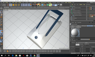
In this post I will explain my main idea of self - heating lunchbox. Today I come up with name/slogan for my lunchbox, it is a 'Take a Break' that's name is dedicated for this product. Why this name? I was thinking about that around a few hrs, I do not know, I just come up with this name and I thing that is good for exactly this product. The company is called "Keep It Hot". Below I will display mains information about my project as a product designer I created a completely new product in a market. I have no idea if this product will be accepted on the market and will go into the sale. Probably not because, I think I am not the first person who thought about such a device in a modern world. Below I will show more details about my project.

Do you like hot meals, and you can not always eat them immediately after preparation? Are you taking lunch to work? Or maybe you are going on a journey and you will not be able to eat dinner? Heated food container 'Take a Break' is the answer to all these situations. Heating and maintaining the temperature after press  the power button, the container turns into a heater - you can heat it up to 50 ° C and then maintain the temperature until consumption battery. Thanks to the solid thermal insulation of the walls and the lid of the container, even after disconnecting from the power supply, the meal will remain pleasantly warm for a long time.

Functional space for various meals.
The 'Take a Break' food container has a capacity of 1.5 litres, sufficient to pack at least two portions. It is tailored to the user, so you can easily separate different products from each other - for example, sauce and potatoes. Thanks to the removable container, there is also no problem with transferring and heating the soup. The lid has a comfortable carrying handle and a special place for the spoon and fork attached to the set.

Irreplaceable in many situations
Due to the battery power supply, the 'Take a Break' container is perfect for all places you go regardless of whether there is a power supply or not, also in which electric sockets are available, but there is no direct possibility to prepare a meal. You will appreciate it especially in the workplace, where you can now heat up the prepared meal, even if there is no microwave oven or electric heater directly connecting to the USB port on your computer. In addition, lunchbox is useful, for example, on a plot of land, or while travelling - electrical sockets are not available at many airports, stations and in public buildings, and even in some modes of transport.

Technical information about self-heating lunchbox called 'Take a Break': 
Width: 25.50 cm
Height: 6.50 cm
Length: 17.00 cm
Capacity: 1.50 L
White/blue color - custom made color
Power consumption: 40 W
Power supply: 12 / 220-240 Volts
Microwave: NO
Washing in the dishwasher: NO
Freezing: NO
(Warranty: 30 months) - Heheh 

Looking at this picture, you're still wondering if this lunch box will be right?


BAAAAAAAAAAA! IT'S PERFECT!

Made in the U.K with the highest quality materials - your new 'Take a Break' lunch box has everything you need for your everyday meal, wherever you feel like it. Take whatever you want with you and heat it up!

You can use the container in various ways and its use knows no limits. It has removable compartments, including one additionally divided 100 and 300 ml.


Do you need a large portion of dinner? Leave the compartments in the house. Do you like varied meals? Organise all the chambers with potato salad and, for example, a delicious chicken stew or grilled chicken. It is also perfect for various types of salads. At your disposal, you have 1.5 litres of auxiliary space always at the ready when you get hungry.

http://cdn.shopify.com

The container has a handy fork that will help you eat a meal. The set also includes a container with a capacity of 300 ml for soup and containers with a capacity of 100 ml for chopped tomatoes for lettuce, sandwich paste or for example a dip. Perfect 'Take a break' you will love from the first use, after eating a meal, it is enough to put it in the sink, wash it with warm water and on the next time it will be ready for use.

Some more important information about self-heating lunch box "Take a Break":
- the battery is sufficient for 3 heating till 50 degree Celsius  - only in outdoor version 
- free of harmful substances (BPA free)
- it has three power sources: battery, 230 Volt and USB-12V
- six divider combinations available to users
- lunch box consists of removable walls and three removable containers, which are easy to wash
- 1.5-liter main container and 0.3-liter container with lid, eg for soup and 0.1 container do example sauces and fruits
- reliably and aesthetically made device is equipped with a PTC heating element that allows heating up to 50 ° C within 25 minutes
- additional storage for a spoon (spoon and fork included)
- fordable handle for easy carrying
- a special "vent" valve when heating a meal
- premium product - high quality
- lid with clips for easy closing
- the indicator lamp indicates the device's operation
- do not insert into microwave !!!
- do not throw in the dishwasher (wash by hand)
- a perfect gift product for those who care about healthy nutrition, children or those who start their adventure with diet, thanks to this you will be systematic.

At the end this post I would like to say that It is not easy project in every aspects such as creating, come up with instructions and with specification, using software's to design exactly this what you want to do, also creating a advertisement of this product is not easy. I hope that in this post I shown you my main idea and now you know my product better then before. I think that I presented everything very clear and understandable. I have learned how to do product description which will effect in my progression rout in the future as a product designer.


Tuesday, 27 November 2018

Product design - Major project Part IV

Hello readers!
I am going to show you another one step of process of designing my lunch box. In this post I will create a lid with small place for fork and spoon.

I created a new flat object in which I have cut out hole for a spoon and fork. This hole have elliptical shape thanks to the fact will be easy to take out and put back our cutlery from middle of lid.

This screen shows side elevation of lid. As we can see, it is convex. Now I have to add a handle to easy carrying it in hand.

I added handle and important thing - vent hole. I was using polygon object with subdivision surface to model the right size and shape of the handle. The ventilation hole in the food container is a very important part. This hole provides ventilation during the heating of food, thanks to which the container will remain intact - it will not explode, where the air produced by eating through heating it.


After finish a lid I added it to box as below.


Product design - Major project Part III

Hello!
Tonight, I am continues to work on my lunchbox.

I am going to add dividers. Using the 'Create Object' tool, I added a few objects, I changed the position, size and rotation, as a result a get flat plate.


I added them into my box. 

As a result I got already my dividers inside my lunch box. At the beginning of my project, I assumed that I would also add more opportunities for the user to store various types of food.  I created additional small containers that can be insert into the box. First container is for a soup with separate lid, separate lid ensures that the liquid, like a soup, does not spill inside the container. 


I also decided to add smaller containers for storing fruit or sauces, depending on the user, also with separate lids.

I put them inside the lunchbox. 

In the meantime I added textures and protuberance to elements. 

This is my result below. Personally, I am happy with my work.I have done it as my best, but I do not know well enough to do everything perfectly, I'm learning 3d graphics all the time so please understand me if something does not look good or something is wrong 😉💁 I am also unable to explain very precisely what I did step by step as in Photoshop because my adventure with 3d graphic was started quite recently.  Personally, I prefer 2d graphics and I absorb all those software easier. 3d is quite difficult and need lot of time.👋 I believe that in the future I will be able to quickly design 3d graphics, even at a very advanced level.


Monday, 26 November 2018

Product design - Major project Part II

Hello, tonight I started work with my lunchbox in software Cinema 4D.

Using simple tools I created based of my lunch box. One of those tools is called 'deformer', with this tool you can make a lot of modifications that would take a lot of time in a traditional way. Of course, the effects can be obtained statically - simply as a normal render or animation. 

I used modelling tools to create base of my lunchbox and simple shapes of scratching my box without any advanced formatting.


In next step I added a middle part of lunchbox, this is a place for food, new shape by adding a new model. You can add a lot of models into your project, it works very similar as layers in Photoshop 


Now I have some simple shapes, I have to the right shape for my lunchbox is modelled, after a couple hrs that is a effect below. 


The box still has no right shape which I designed before. 
Using the tools presented below, I created the right shape. I also added colors and simple textures to be able to distinguish all items.


These are the tools for formatting models.


With this option, we can add various elements of our 3d graphics.

After a couple hours of my work with it, I added a power button, diodes and usb in/out. Also I have put color to separate base from middle part of lunchbox.   


Below I present around 5 hrs of my work with Cinema 4D. 


I am happy with a result, in next post I will add more elements to my project. At the moment this outcome is very poor, without any detailing and realistic textures. 

Product design - Major project / Create Advert Part I

Hey!
Today I wanted come up with logo for my lunch box and I had a little problem with it. Fortunately my class mates help me to come up many names such as habba babba, keep it worm, keep it hot, hot love, on the hot side, never cold, tasty and hot staff. From many ideas I choose this one which I consider to be the best for me. Personally I think that is very good product name - KEEP IT HOT, because the product is a self heating lunchbox, it is sounds interesting and catching.

Thank you for all my collages for help me to choose right name.

After decided which name will be the best for my product, I joined the creation of the logo.
The software which I used to do that is Photoshop. Below you can find a bit more about creating process.

I opened new document in Photoshop. I decided to create logo on A4 size with color settings CMYK, maybe in the future I will need to print it, that's why I choose this colour profile. The CMYK color model is a subtractive colour model, used in color printing, and is also used to describe the printing process itself. CMYK refers to the four inks used in some color printing: cyan, magenta, yellow, and black.

I typed my company name into the document as below. I used a random basic font which is called 'Century Gothic'. It is simple and clear font, can be used to many projects.


In next step I wanted to emphasise more 'it' so I changed 'i' for a capital letter and I added red color, because it reminds me of something hot and worm. 


I received the effect of a simple logo but, I wasn't happy with that. It is something messing form logo, I think that I need add some graphic into it. I come up with fire over 'o' letter. I created a fire using a tools in Photoshop such as Pen Tool to draw marks and bucket tool to paint my fire. 


After created a fire I added it into logo, over 'o', because the fire looks better over the letter o than over the letter e or letters 'it'.


This is a final outcome of my product logo. Now assuming that I will need to put it into my lunchbox, I need two versions. First one is this one below and a second one I need less horizontal to put in the corner. 


I changed a little bit my logo to vertical position. 


Also I created a few more logos for my project but after discussion with my friend and my tutor I decided to do not choose those. My tutor Carrie suggested that 'i' and fire over it looks as a cigarette. 


Below final outcome:

Horizontal: 
Vertical: 

In conclude, I am very happy with this final results, because logo looks nice, the contrast colors are good.